St. John’s Market
Completed Date
2019
Industry
Hospitality
Discipline
Brand Design


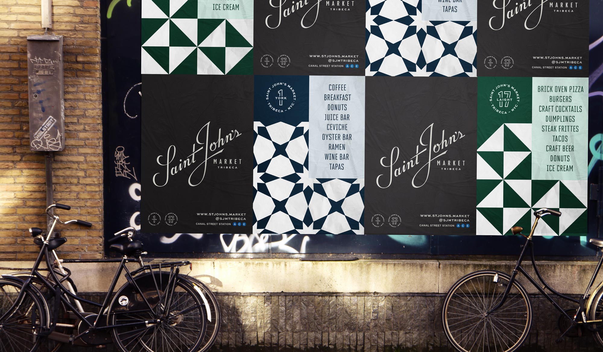
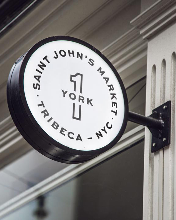
Twin identities were developed for Saint John’s Market, which spans two street addresses. They are bound by a delicate custom script mark, inspired by midcentury hand-lettering, and the overall look is supported by a series of geometric patterns based on tiles installed at the market’s entrances. A pair of cool palettes set the separate addresses apart, while an overall color scheme unites the project as a whole.


