Aster
Completed Date
2021
Industry
Apartment / Mixed-Use
Discipline
Experiential Design
At the entrance to Aster, the building’s identity is established with non-illuminated channel letters mounted to an understated raceway. The simplicity of this sign allows the vibrancy of the nearby mural to take center stage.
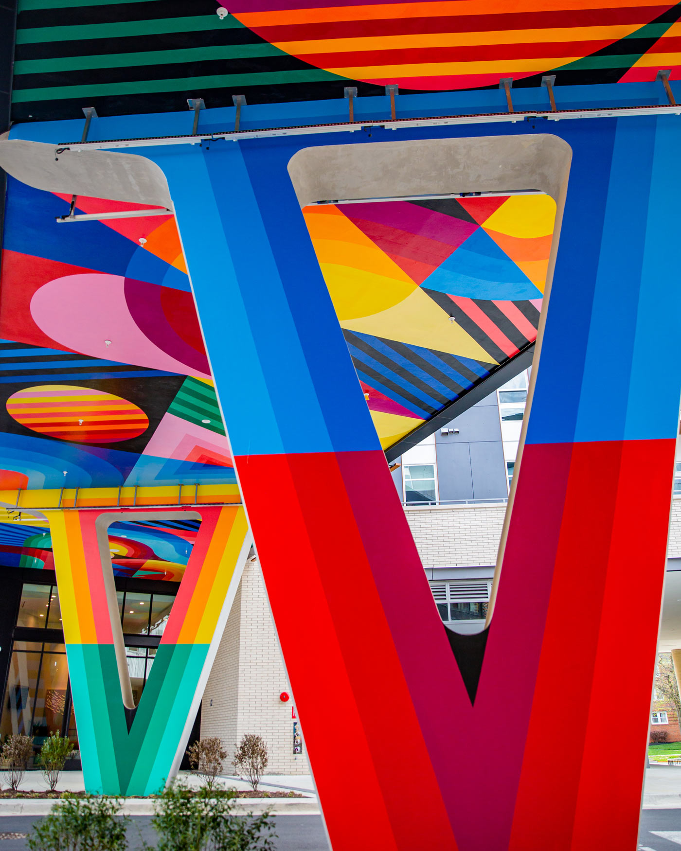

This dynamic art by mural painters Jessie Unterhalter and Katey Truhn uses a vivid, saturated palette that contrasts with organic green shades in the buildings interior. Their trademark bold shapes and bisecting lines play with the building’s architecture and give unexpected liveliness to the underside of this walkway.
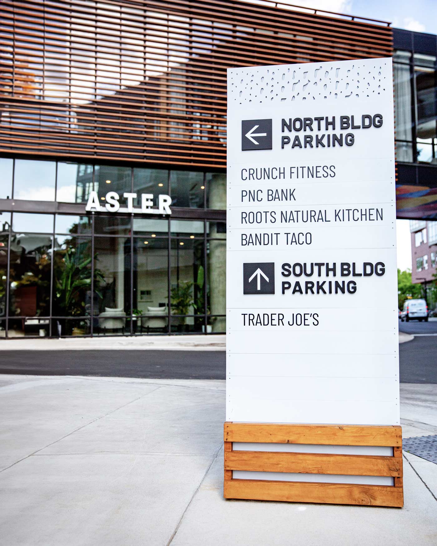
Aster’s brand patterns were punched out of the top of this large standing directional sign, which was fabricated out of a combination of wood and metal. This subtle detail adds an intriguing texture, a motif that will pop up frequently throughout the project.

A suite of custom icons were developed for Aster, and used throughout the building’s signage. These playful glyphs depict the building’s amenities with a consistent artistic style that translates well into dimensional ADA sign panels.
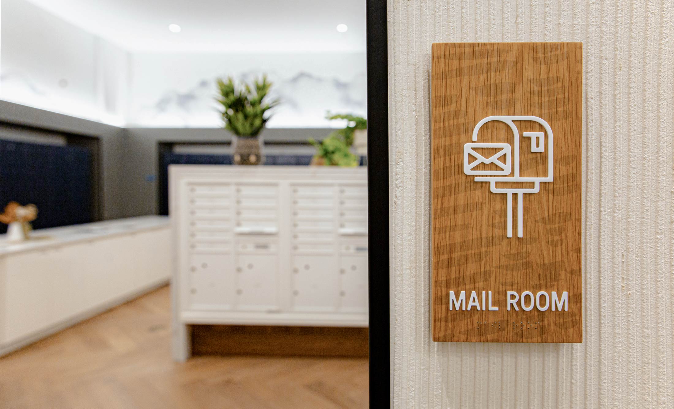
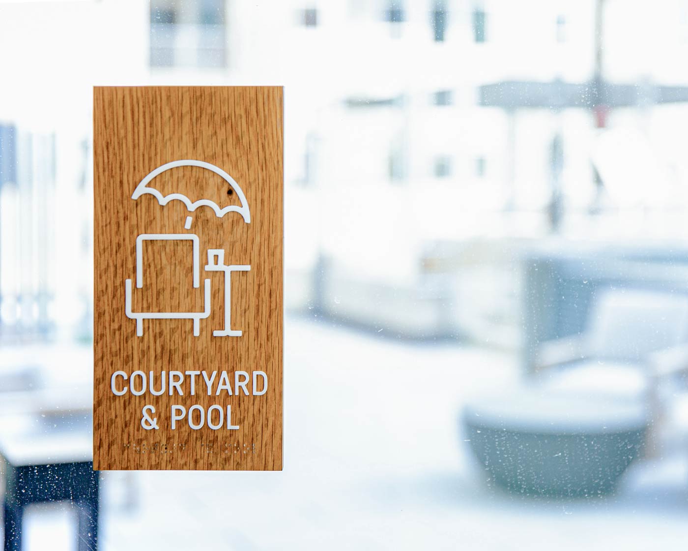
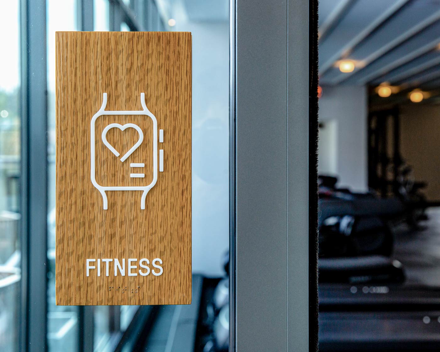
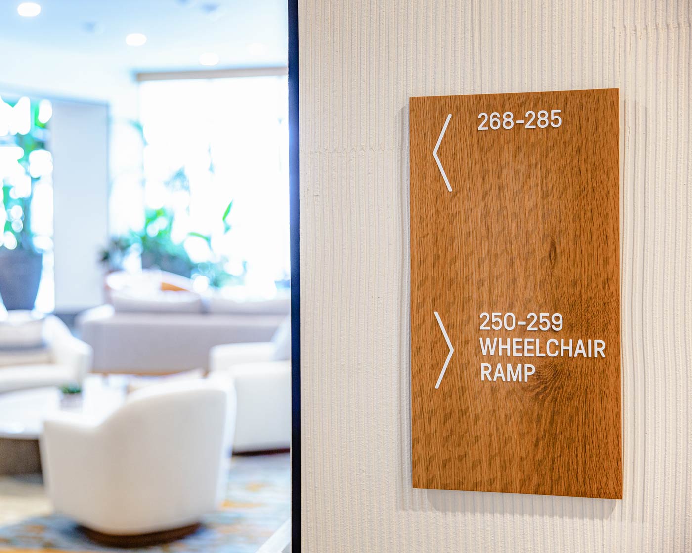
Aster’s brand pattern was printed as an overlay on interior signage , adding another texture to the natural wood grain of the panels. Text, numbers, arrows, and glyphs contrast nicely in a simple white.
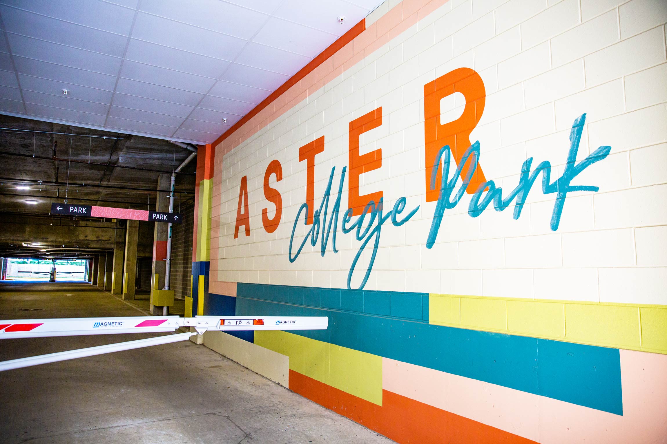
The parking garage mural at Aster uses playful color-blocking to contrast with the industrial finishes of the building, while also recalling Jessie & Katey’s iconic piece outside the main entrance. A playful handwriting-inspired script defines the College Park location.


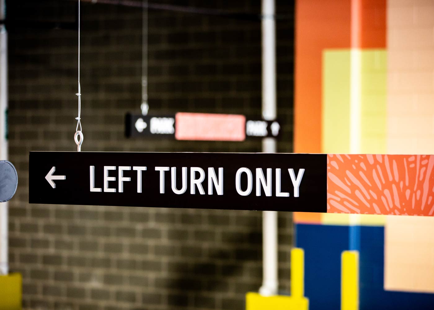
Garage signage is straightforward and functional so as to maximize its effectiveness as a wayfinding tool, yet YDI still brought in pops of color and patterns to maintain the Aster brand’s presence throughout the project.

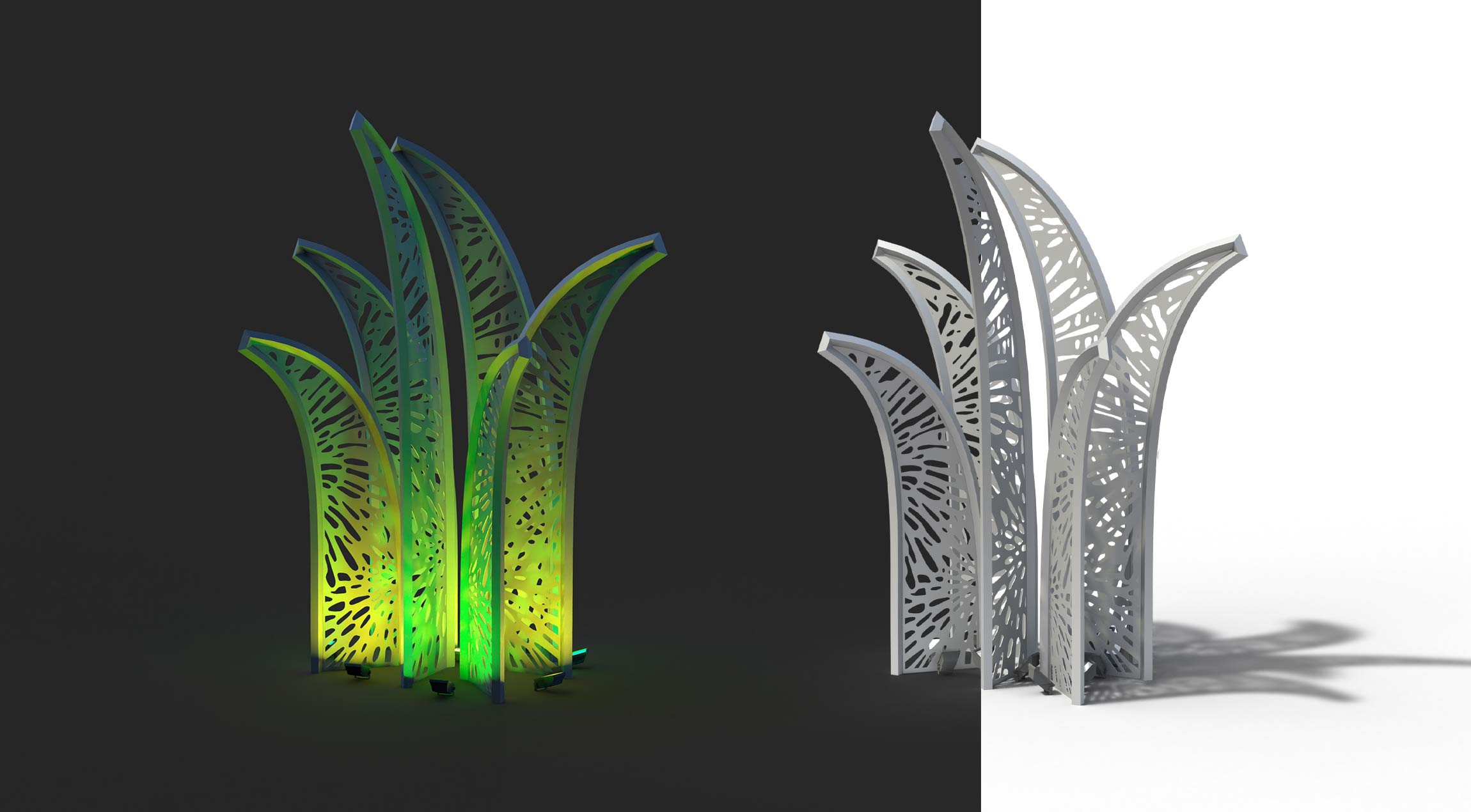
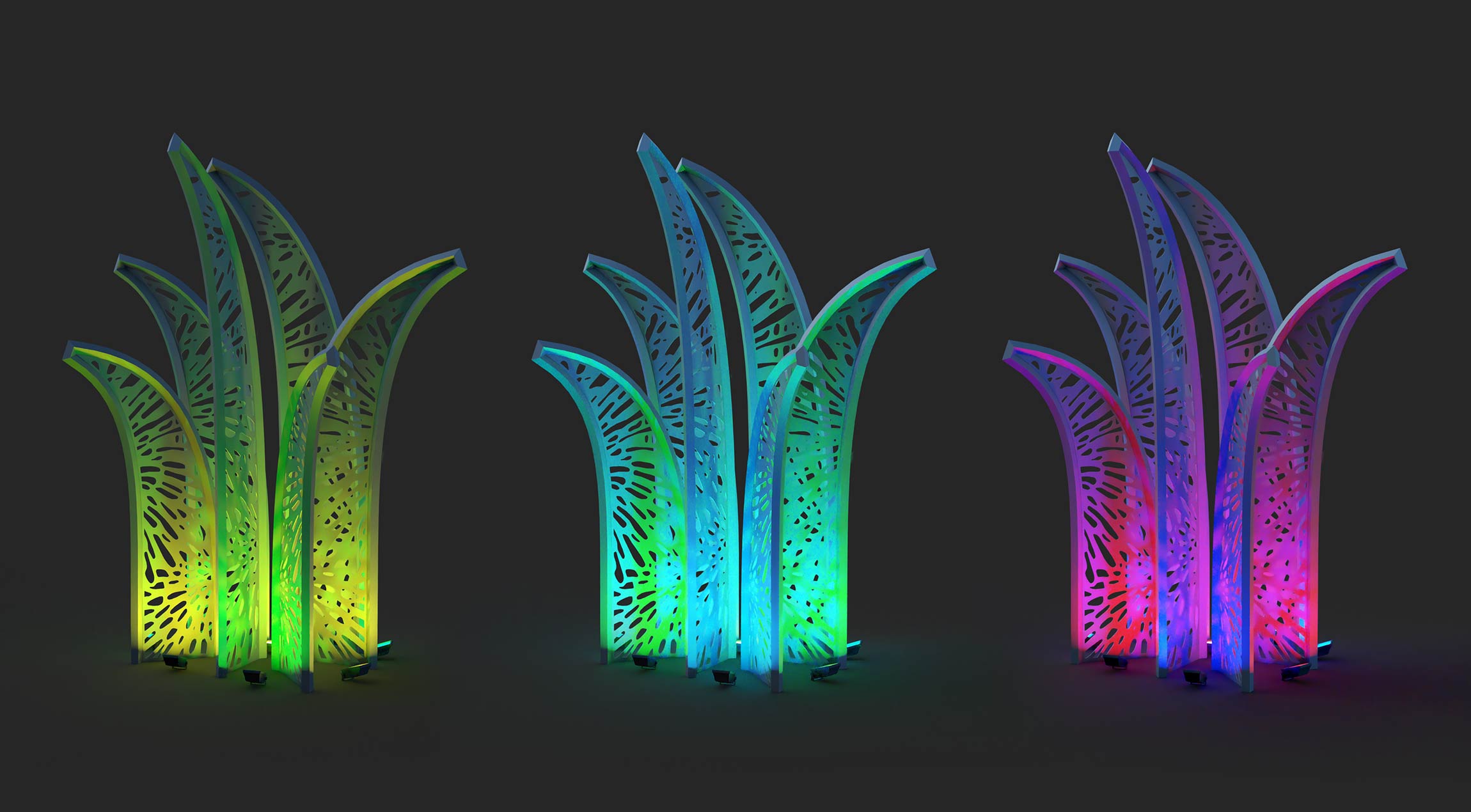
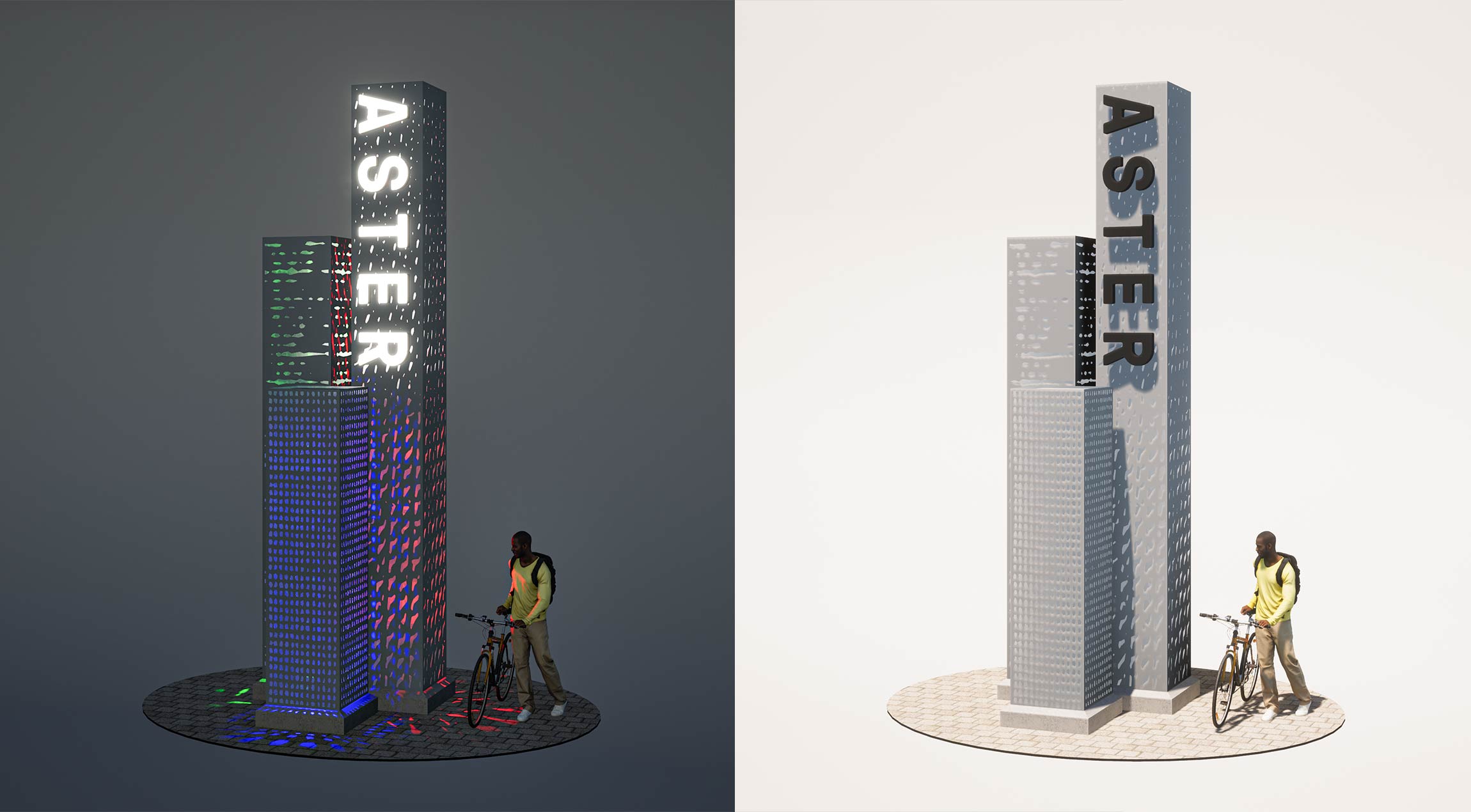
These concepts for exterior sculptural elements recall natural shapes, sprouting like oversized, imaginary plants beside the corner of the building. Alternatively, a concept for a tower-based monument identity sign was proposed, with various perforations in the sign materials alluding to Aster’s brand patterns.
