Atworth
Completed Date
2024
Industry
Apartment / Mixed-Use
Discipline
Experiential Design
Brand Design
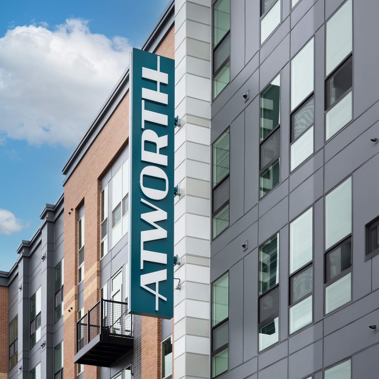
Internally-illuminated exterior signage at Atworth consists of a facade mounted wordmark, a circular logo, and an eye-catching blade sign – all featuring the building’s custom typography.
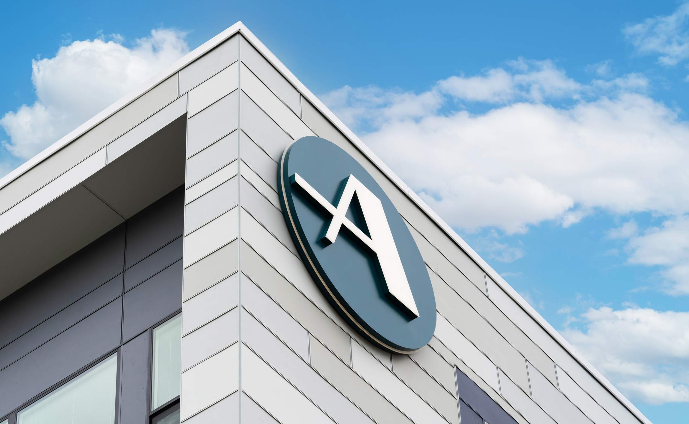
Atworth’s circular badge icon recalls the shape of metro stop signage, while adding the distinct personality of the building’s unique letterforms. This family of marks forms a brand for Atworth that YDI reinforced throughout the project.
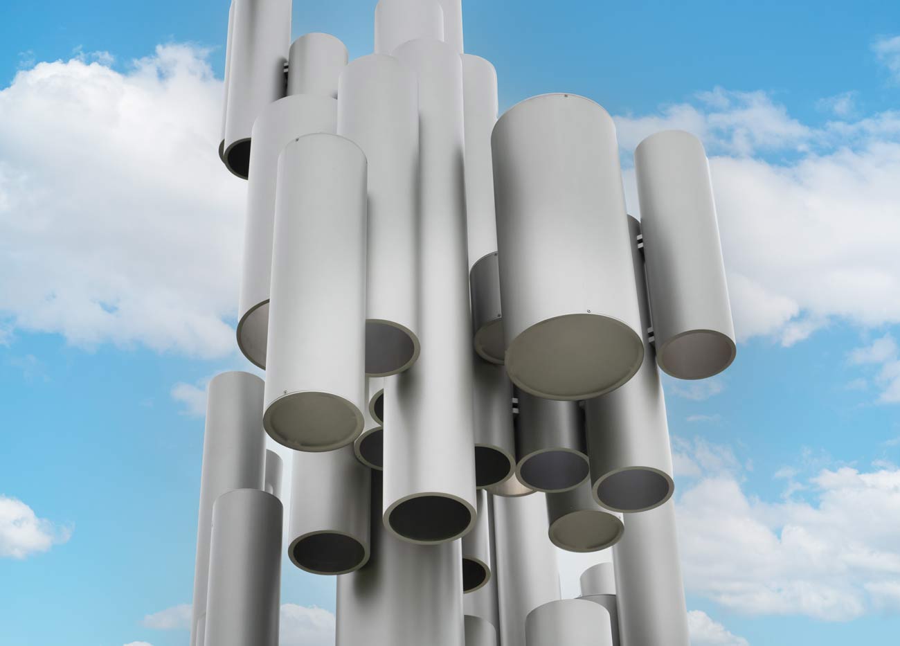
YDI designed an abstract illuminated sculpture for the grounds outside Atworth, inspired by a sense of motion and the streamlined trails of moving trains. The piece is composed of modular cylinders with differing heights, each rotated in fixed increments. Programmable LED lighting allows for striking, custom lighting displays, providing different experiences of viewing the piece in daytime versus nighttime.
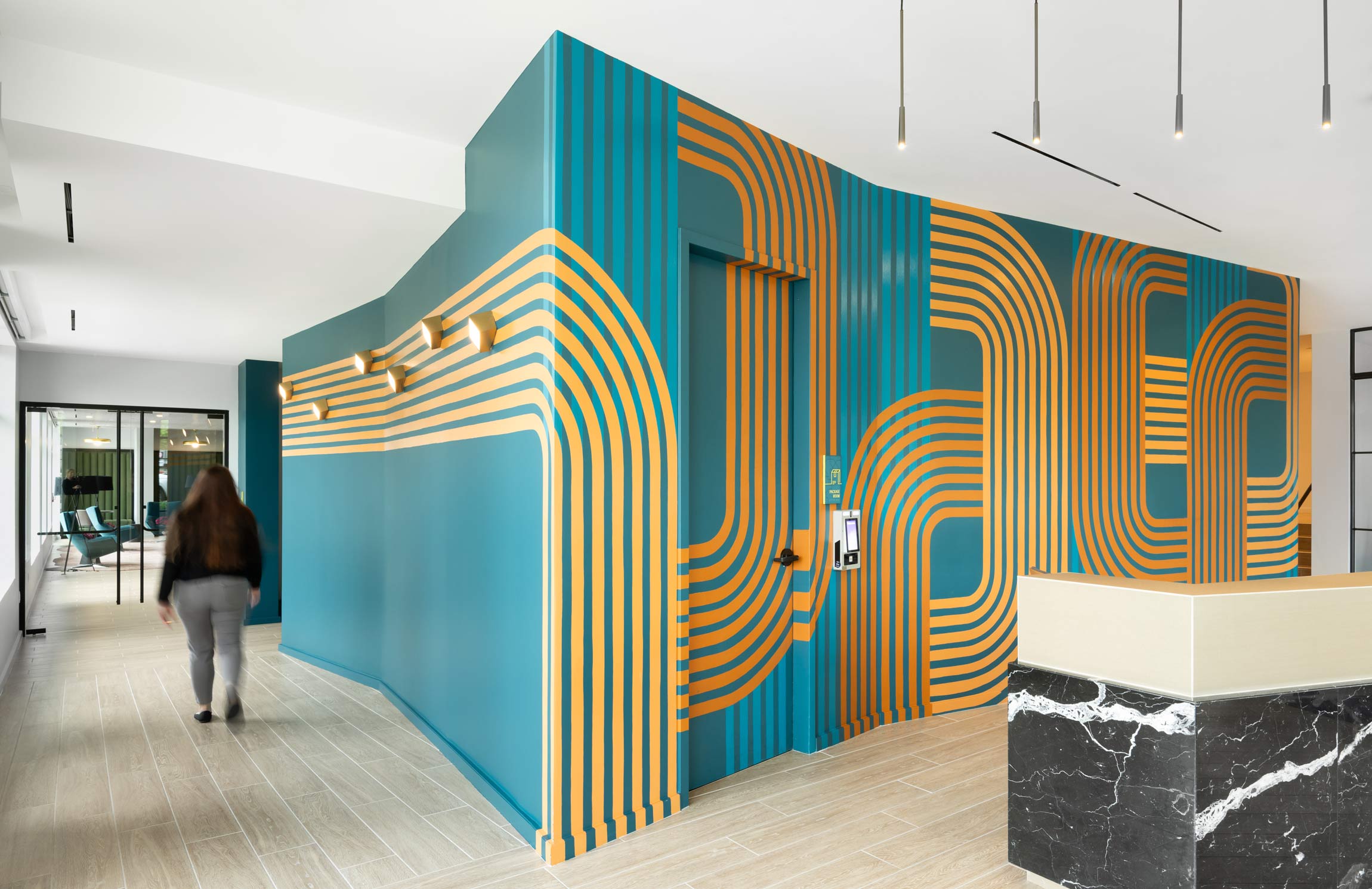

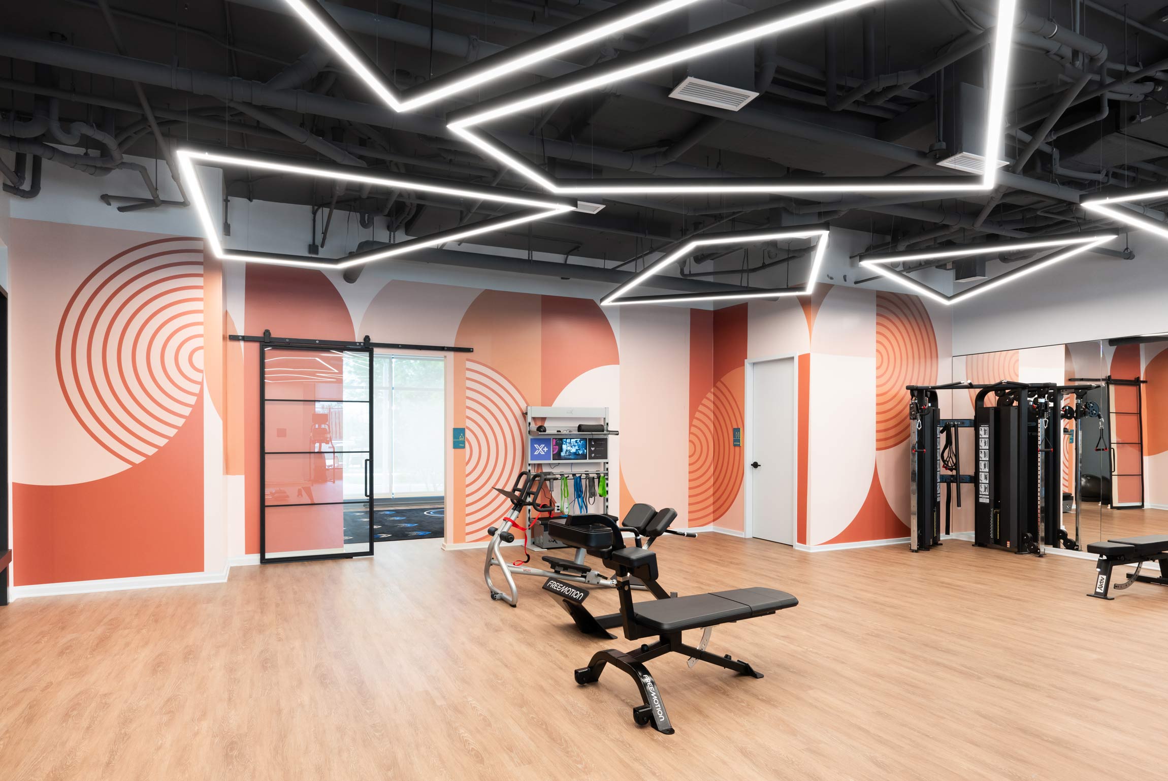
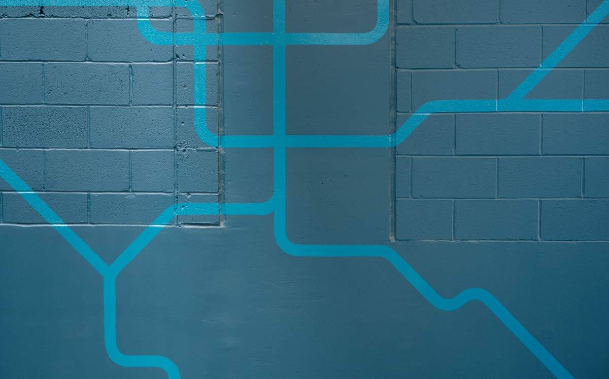
A colorful mural in Atworth’s lobby is inspired by the crossing lines of train tracks and roadway systems in the beltway area. The uniform, curving lines – rendered in varying sheens of paint – contrast with the natural materials and finishes in the space, such as marble. This theme recurs throughout graphics in other rooms, such as the fitness center, where these intersecting lines turn into concentric circles and meandering parallel paths.
The pet spa, on the other hand, is host to simple, playful graphics depicting dogs and cats. Curved, abstract shapes tie the murals together, reminiscent of the forms present in other wall graphics throughout the building.
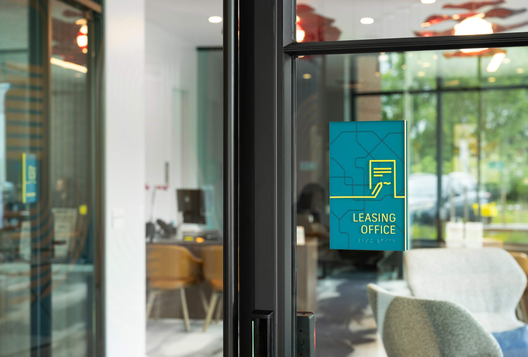
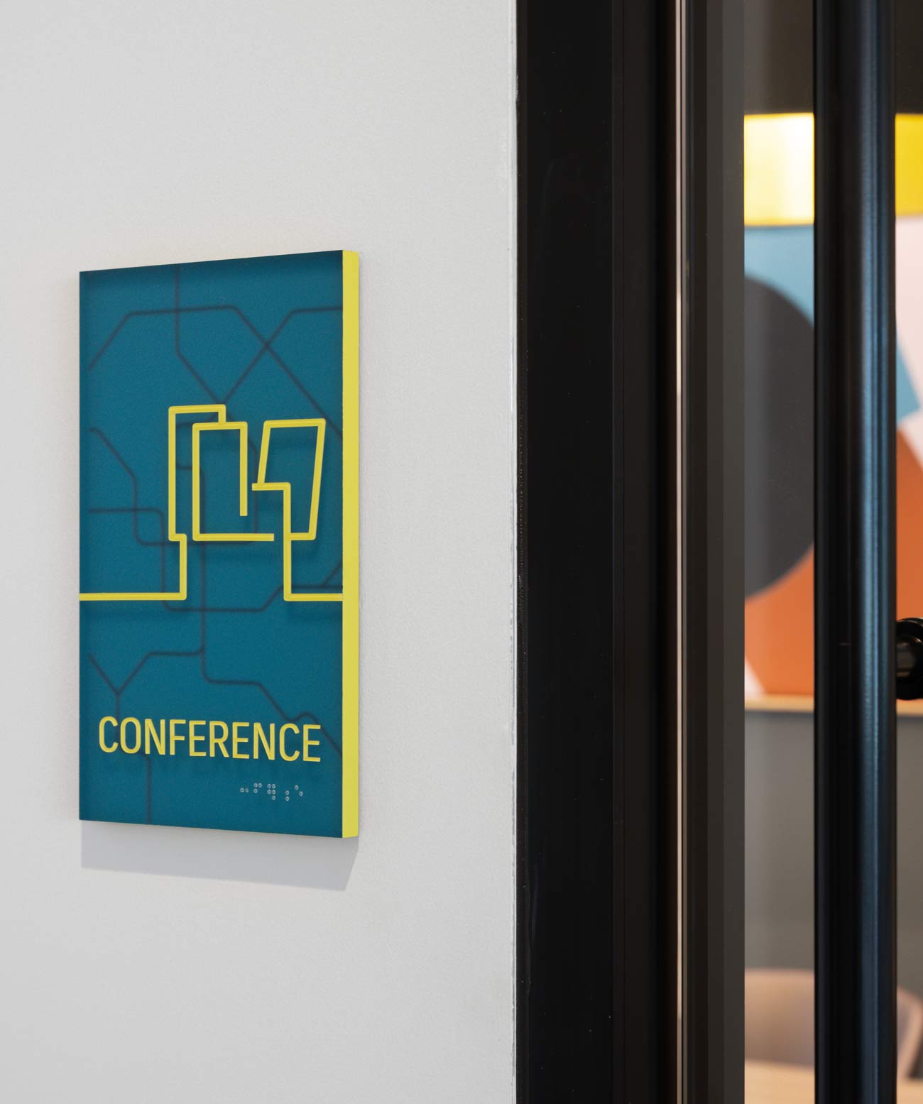
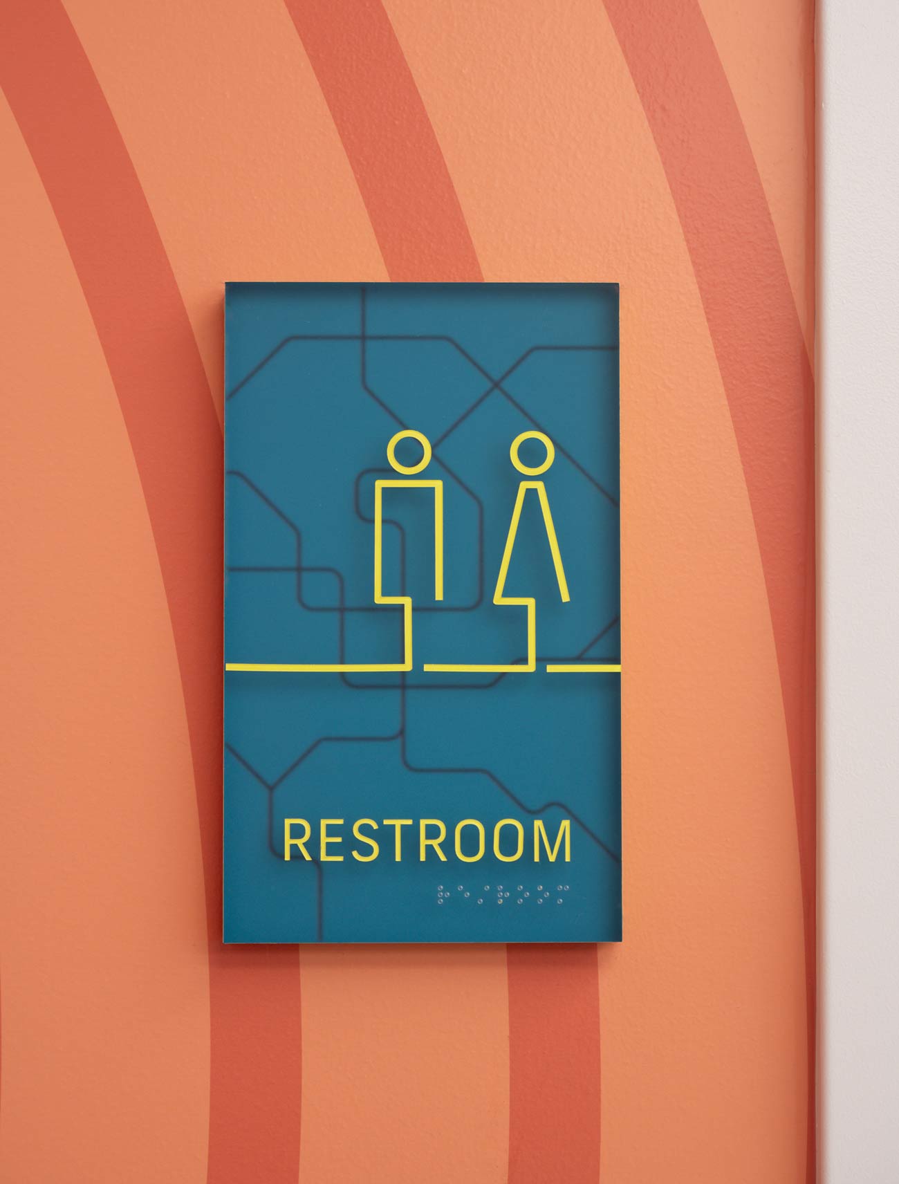
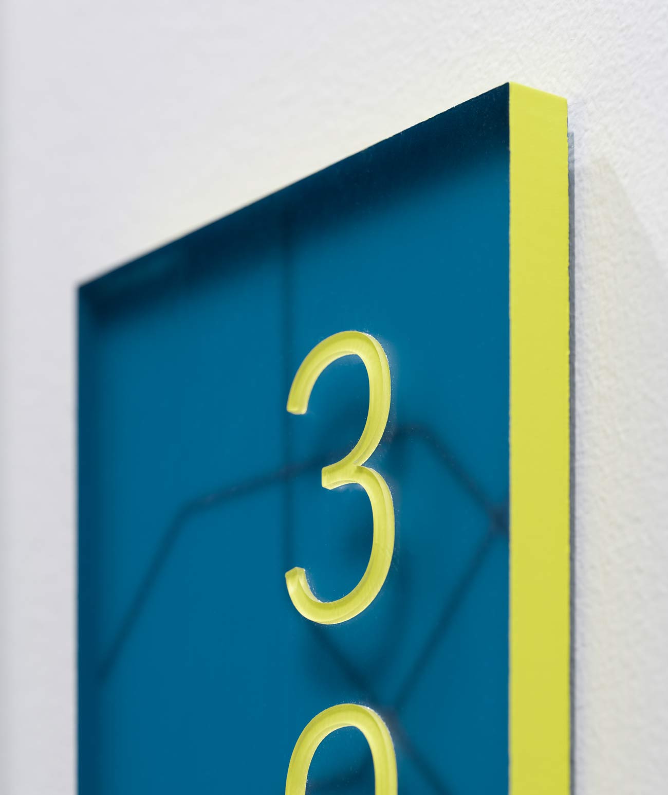
Interior signage at Atworth continues the theme of intersecting transit lines, this time as a background texture, back-printed on translucent acrylic panels. Glyphs, lettering, and unit numbers are mounted to the sign face, allowing for a pleasing depth effect over the pattern. Signage panel edges and text are brightened with lime green to add extra pops of color throughout the building.
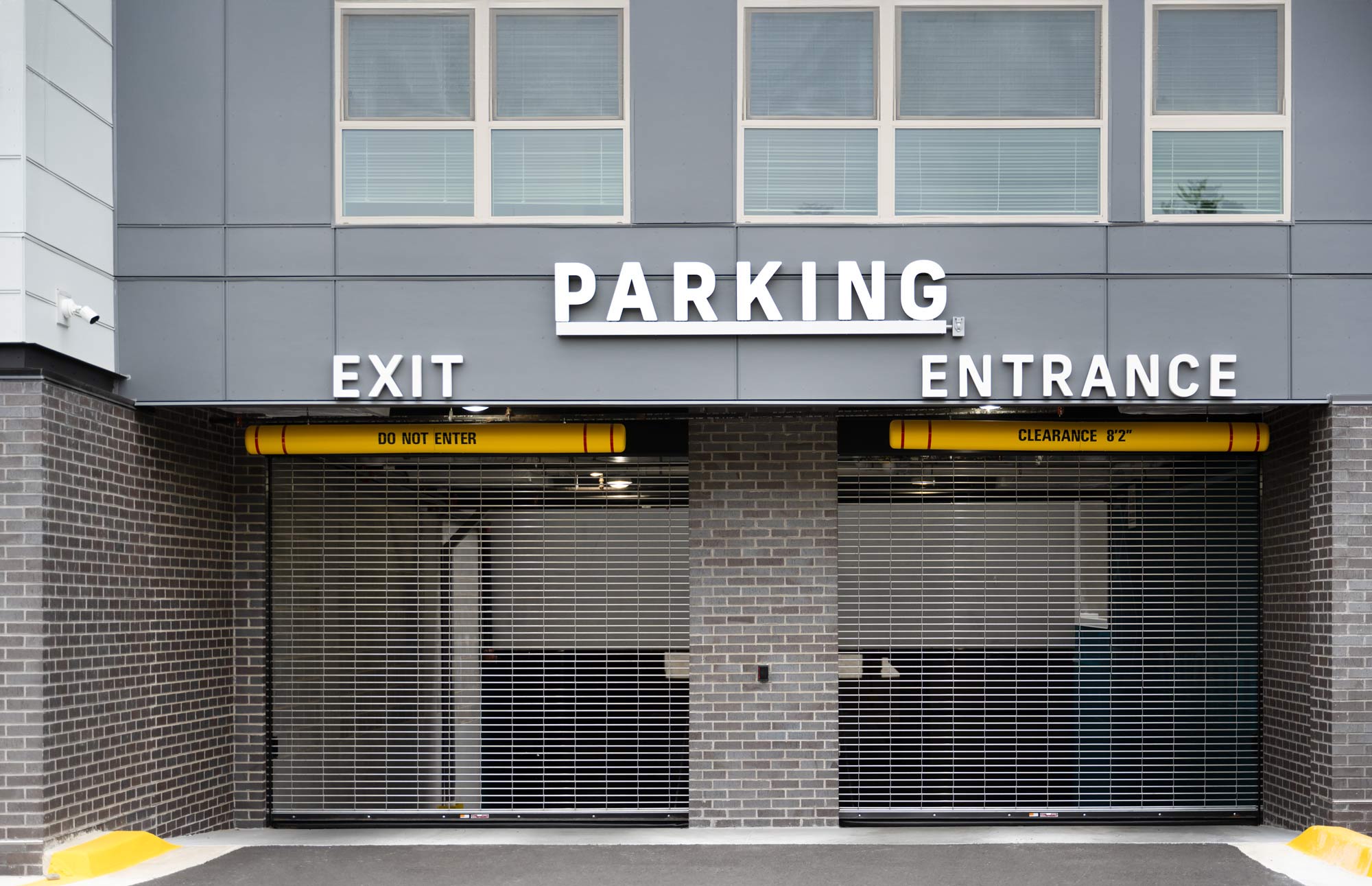
Signage at the entrance of Atworth’s parking garage is simple and effective, allowing for maximum legibility for motorists.
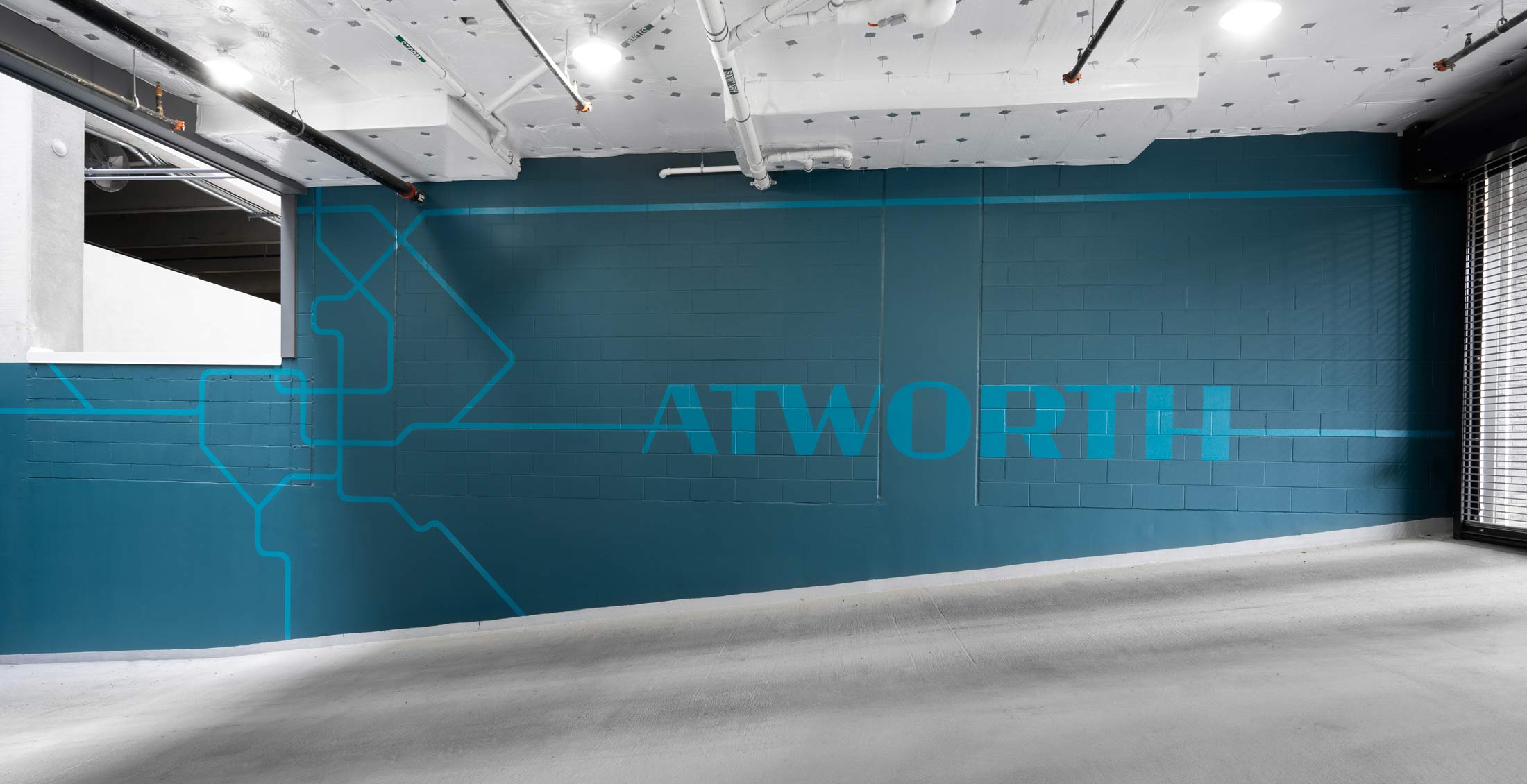
Within the parking garage, Atworth’s brand is reinforced by colorful murals that depict the building’s theme of intersecting transit lines, seamlessly combined with the custom “Atworth” wordmark via its bisecting horizontal line.
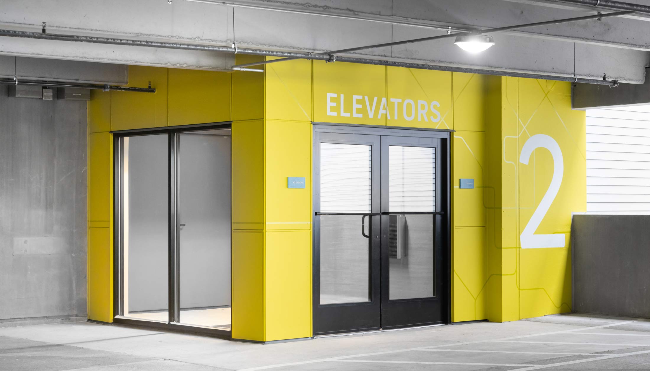

To aid in wayfinding, each level of the garage has a distinct color, which is used in a mural highlighting elevator lobbies. These graphics give the space personality and echo the building’s theme while providing a landmark for pedestrians.
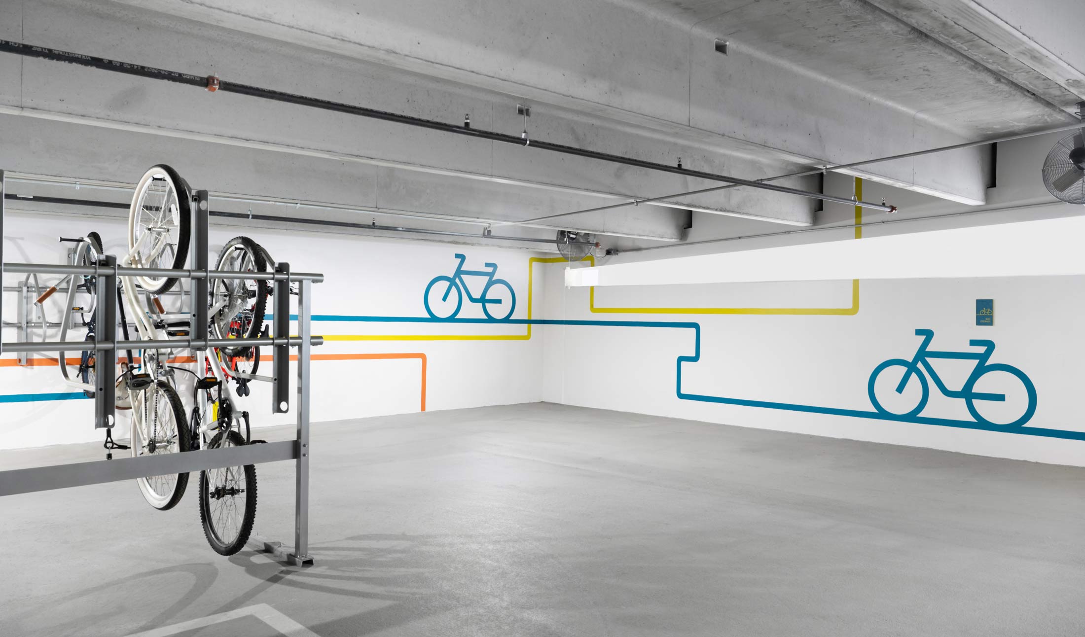
Atworth’s bike room explores another visual take on Atworth’s theme: streamlined bike glyphs and intersecting linework give a sense of movement, echoing the metro lines of mural artwork elsewhere in the garage and apartment building’s common spaces.