Wheelhouse
Completed Date
2019
Industry
Apartment / Mixed-Use
Discipline
Brand Design
Experiential Design

YDI teamed up with 28 Walker to create and apply a brand identity for their new “co-living” development in Baltimore’s Federal Hill neighborhood. The extensive scope of this project gives Wheelhouse a bold identity to match its novel take on apartment living, and brings all its unique features together under one roof.
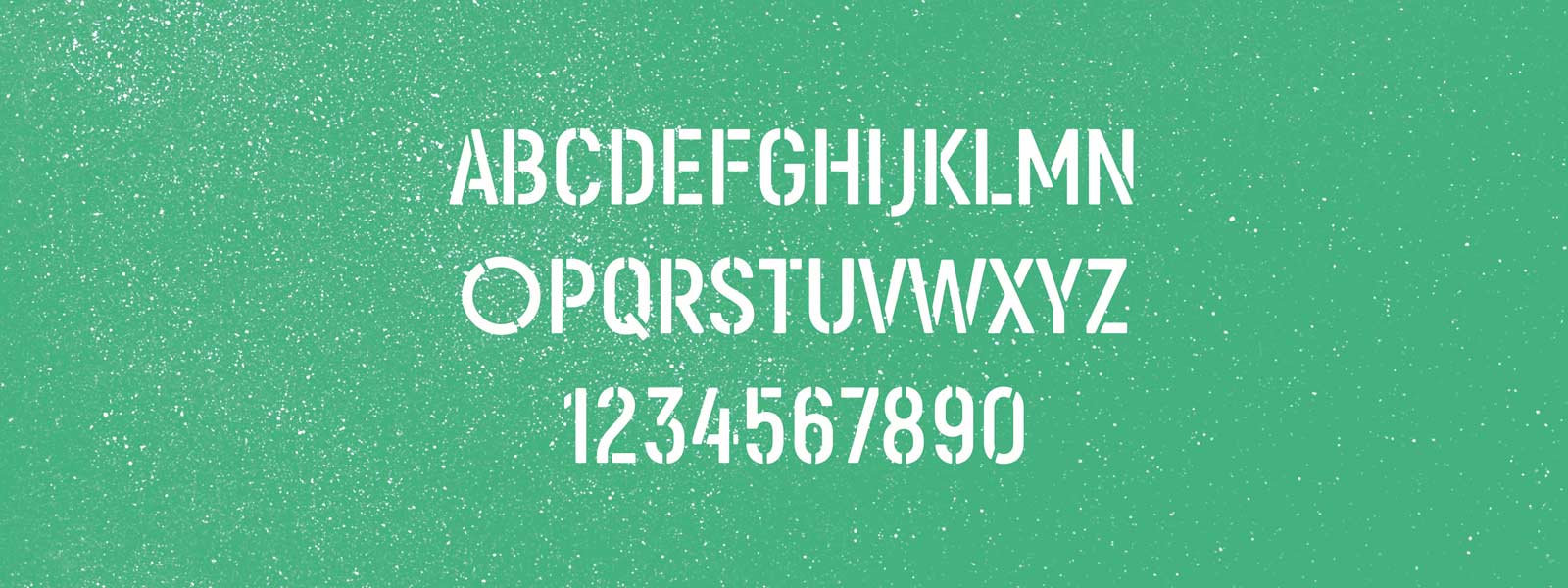
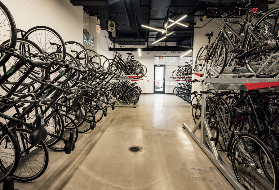
One of the more unique aspects to this co-living concept is the fact that each new resident is provided a bike instead of a parking space. YDI recognized this as a major point of difference in the local market, and chose to celebrate it in both Wheelhouse’s name and wordmark, which incorporates the form of a bicycle into its typography. The visual theme of urban cycling culture is carried throughout the brand visuals with gritty asphalt textures, the green color of Baltimore’s bike lanes, gridded city maps, and a custom stencil font.

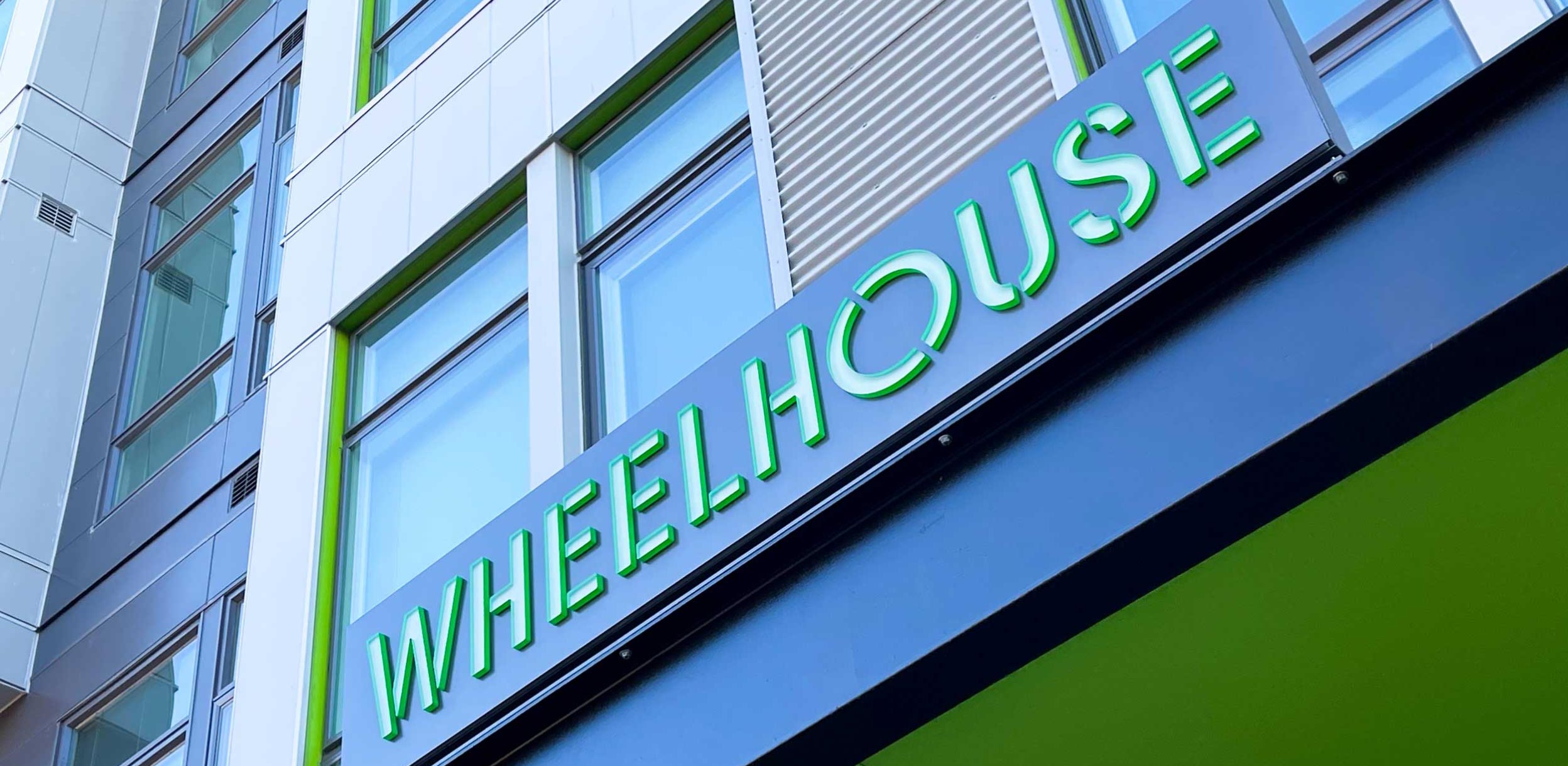
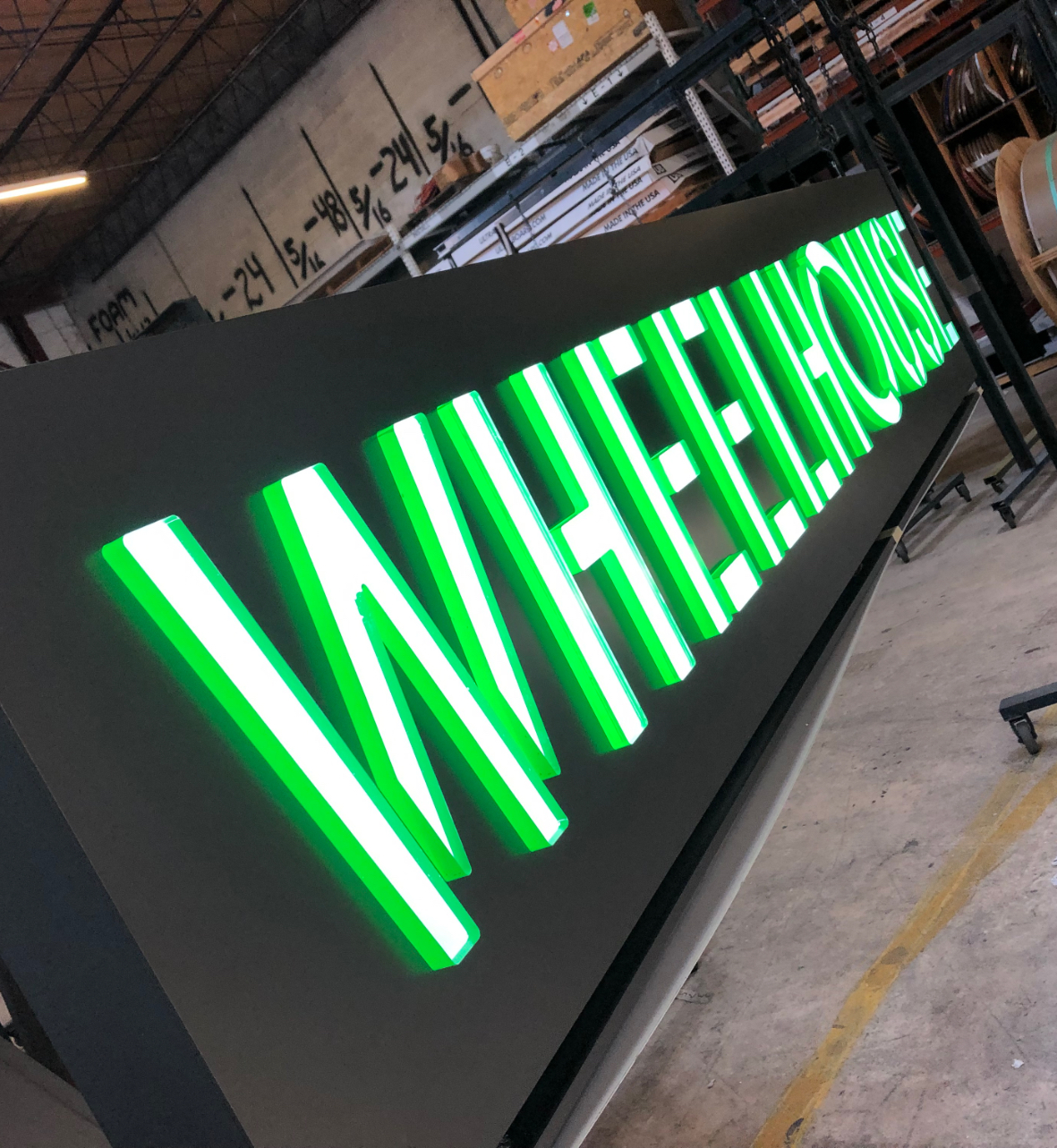
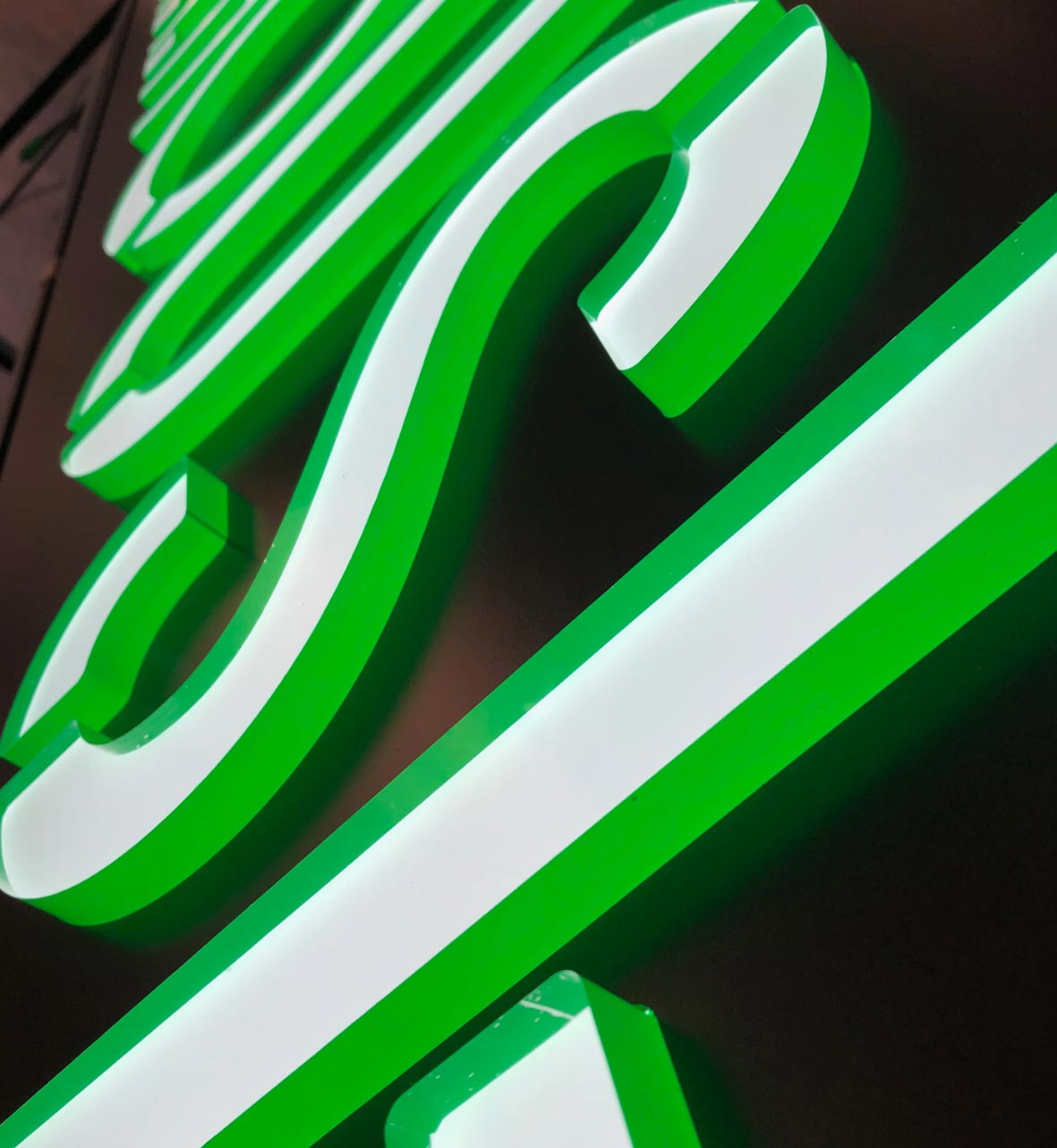
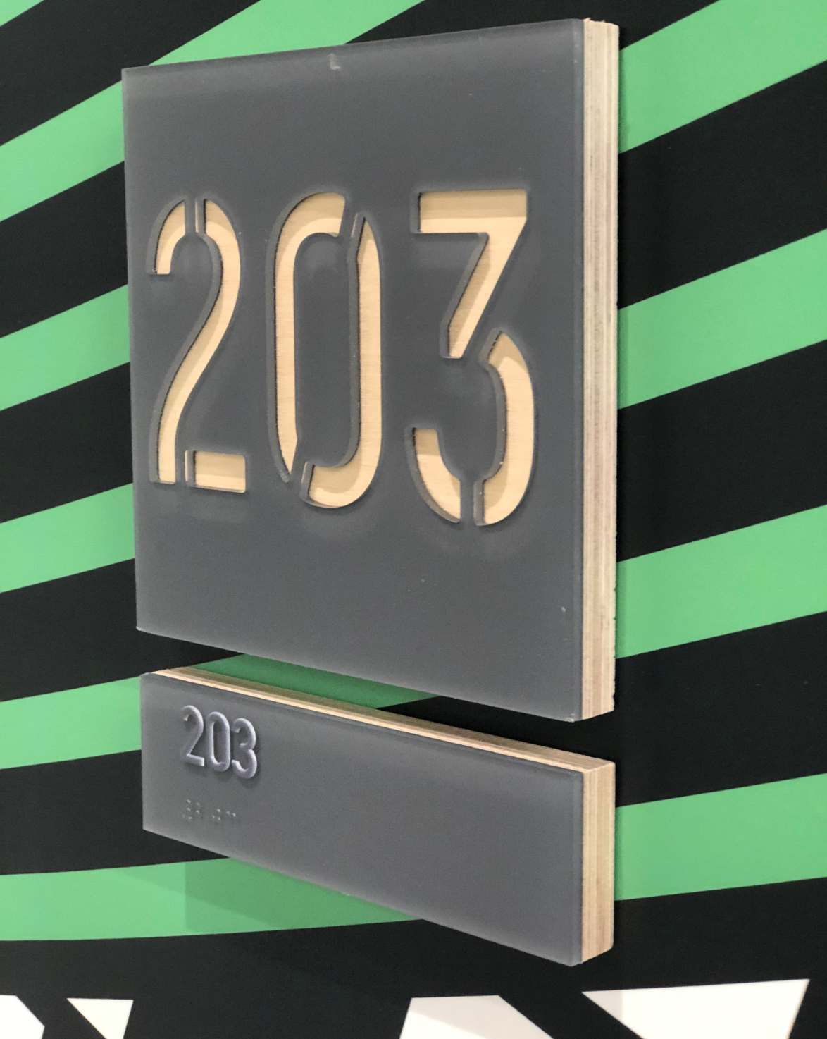
YDI’s next task was to expand the Wheelhouse brand to its physical space. Exterior ID signs were built with a “push-through acrylic” fabrication method that highlights the stenciled wordmark. Wheelhouse’s entrance was designed to feature a dimensional map of the Baltimore City grid, setting the tone for the rest of the interior experience.
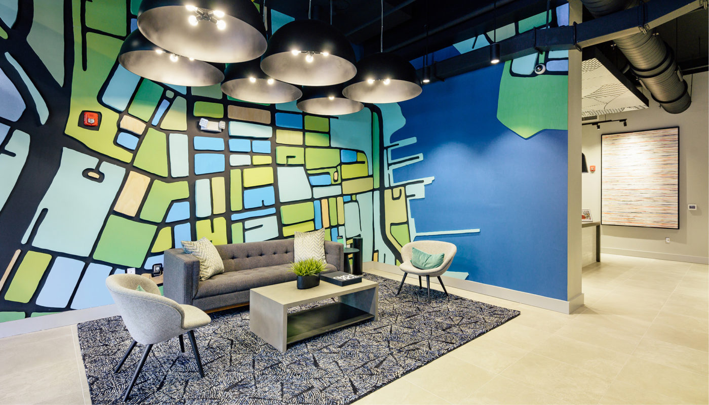
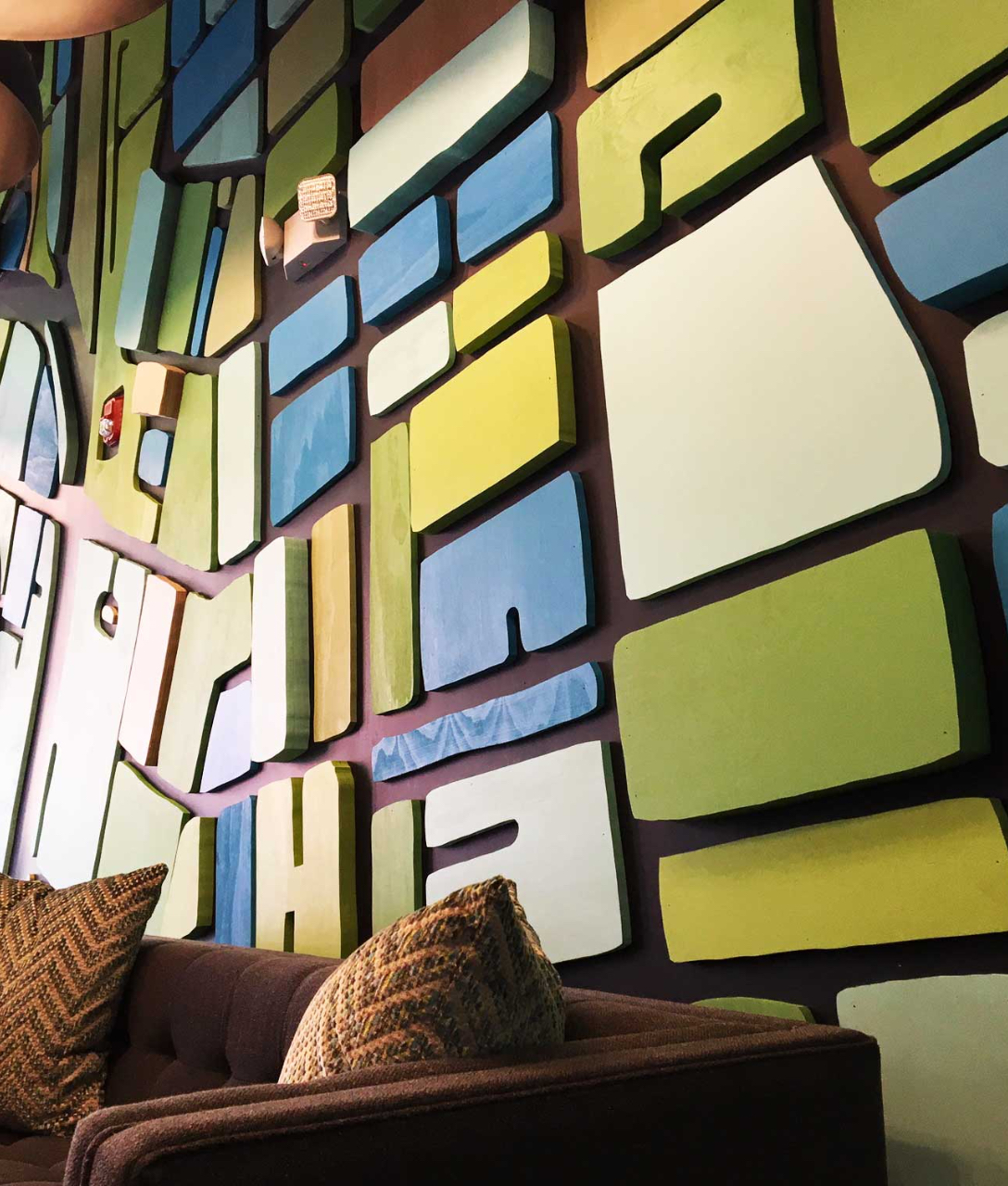

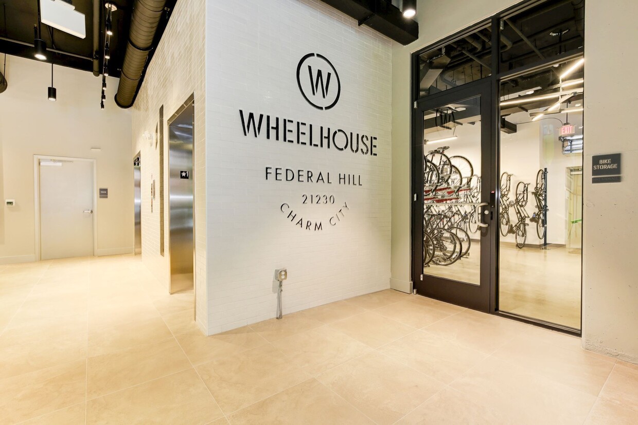
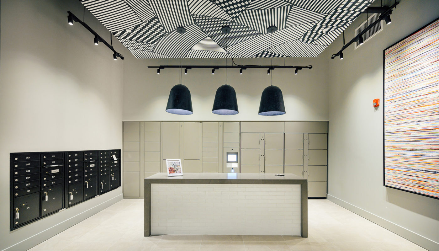
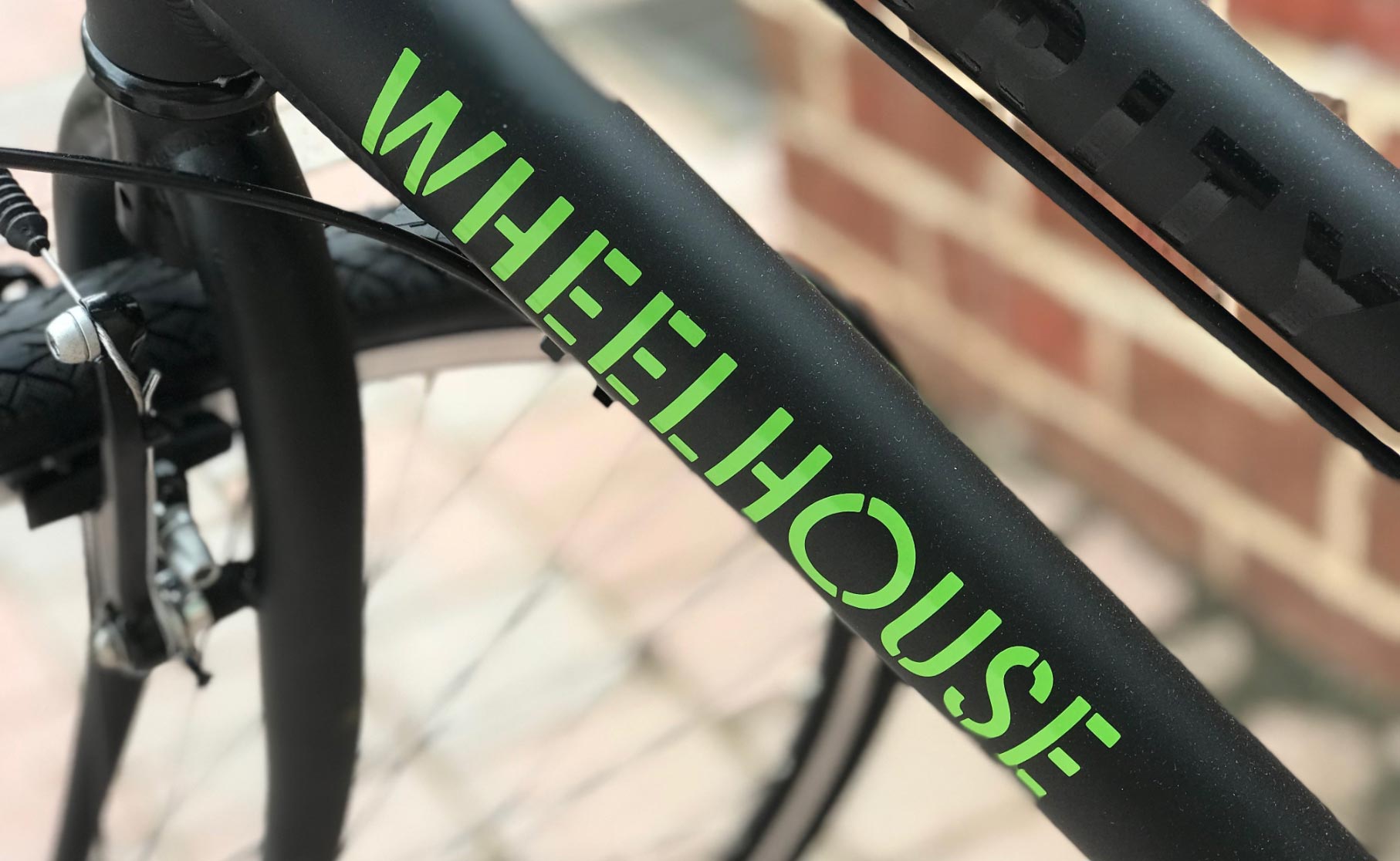
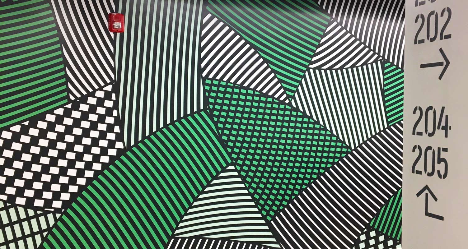
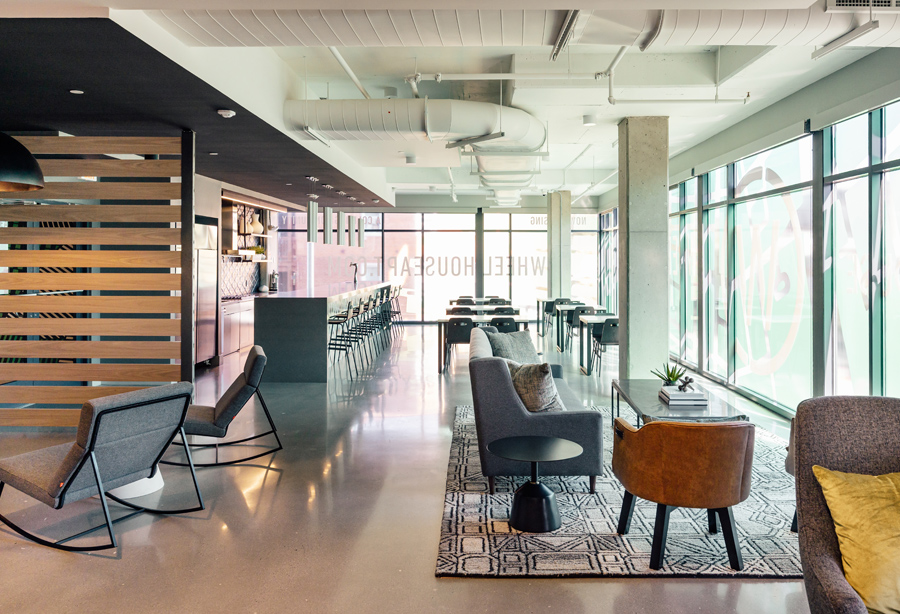
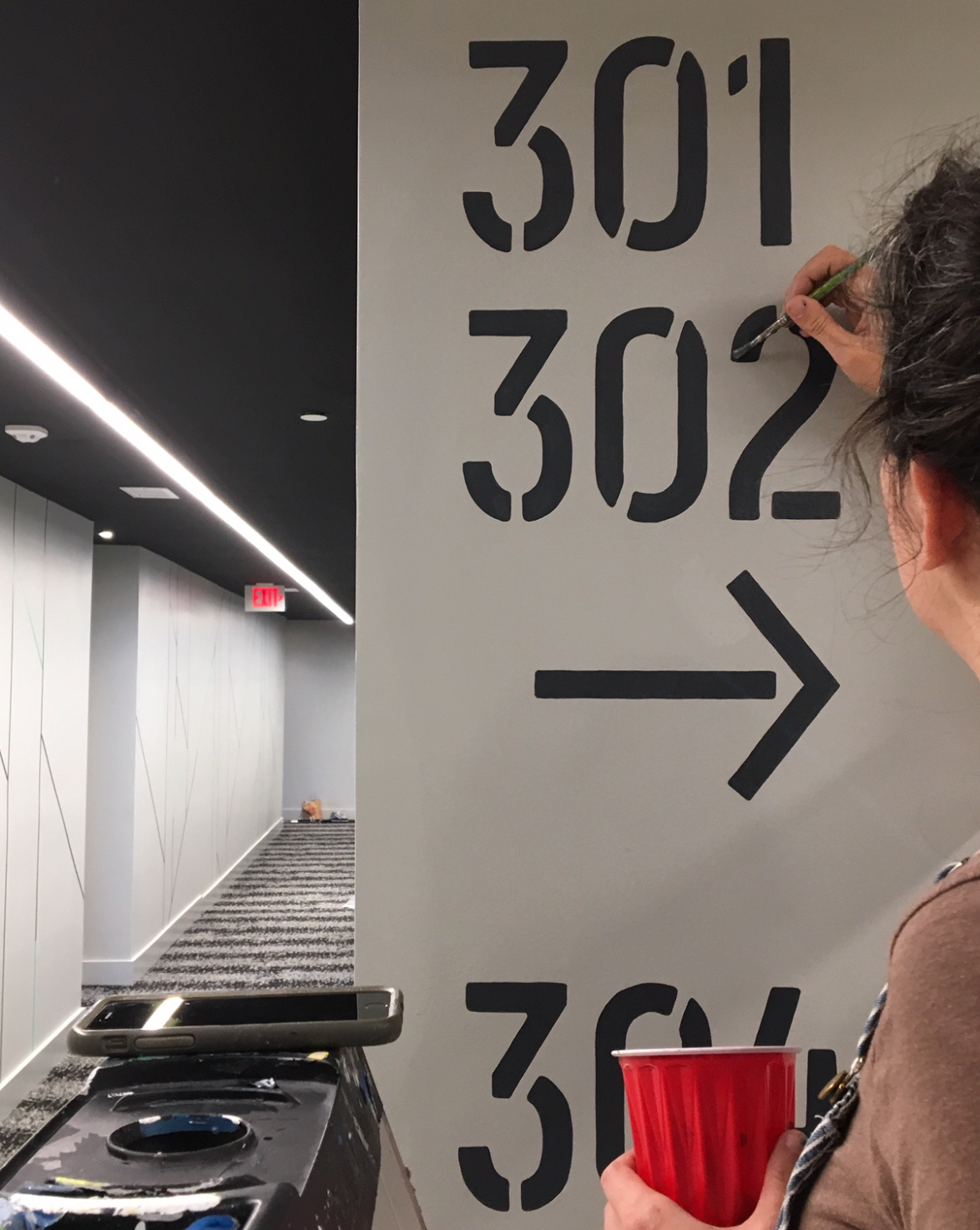
In addition to the dimensional map, YDI also created a series of dynamic patchwork patterns that were applied boldly throughout the amenity spaces in the building. And as with exterior signs, the same stencil font used in interior signage mirrors wayfinding painted into the pavement of bike lanes throughout Baltimore.
Exterior Signage:
Window Vinyl:
ADA Signage: